 |
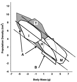
Fig.
2. Log (base 10) population density versus log body mass for
animals. M = mammals, B = birds, H = reptiles and amphibians,
I = terrestrial arthropods, T = intertidal invertebrates,
A = aquatic vertebrates and invertebrates. See Damuth
2007 and references therein. |
|
|
The
figure shows polygons surrounding the regions occupied by points
for individual species in each of several major biological groupings
(798 species in all). Here the body-size ranges from elephants to
soil mites, more than 11 orders of magnitude. Both the trends within
polygons and the overall trend are roughly consistent and virtually
all points fall in the same region between the dotted lines (which
have a slope of –0.75). Aquatic species are on average more
abundant than terrestrial species but their trends are similar.
This
description oversimplifies lower-level details considerably. Nevertheless
the overall pattern is clear, and it is somewhat surprising that
we should see anything coherent at this scale at all. Why would
population densities of such different kinds of species all fall
within the same range of values above and below a line with slope
near –0.75?
The
answer may become clearer when we ask about how the energy used
by local populations scales with their body size.
|
